EasySocial 3.0 Stable Released
Nearly 2 weeks have passed since the release of PayPlans 4.0. Today, the entire team and I are super thrilled to be presenting you with the stable release of Easy Social 3.0. Without further a-do, let's go through some of the awesome lineup of new features for v3.0.
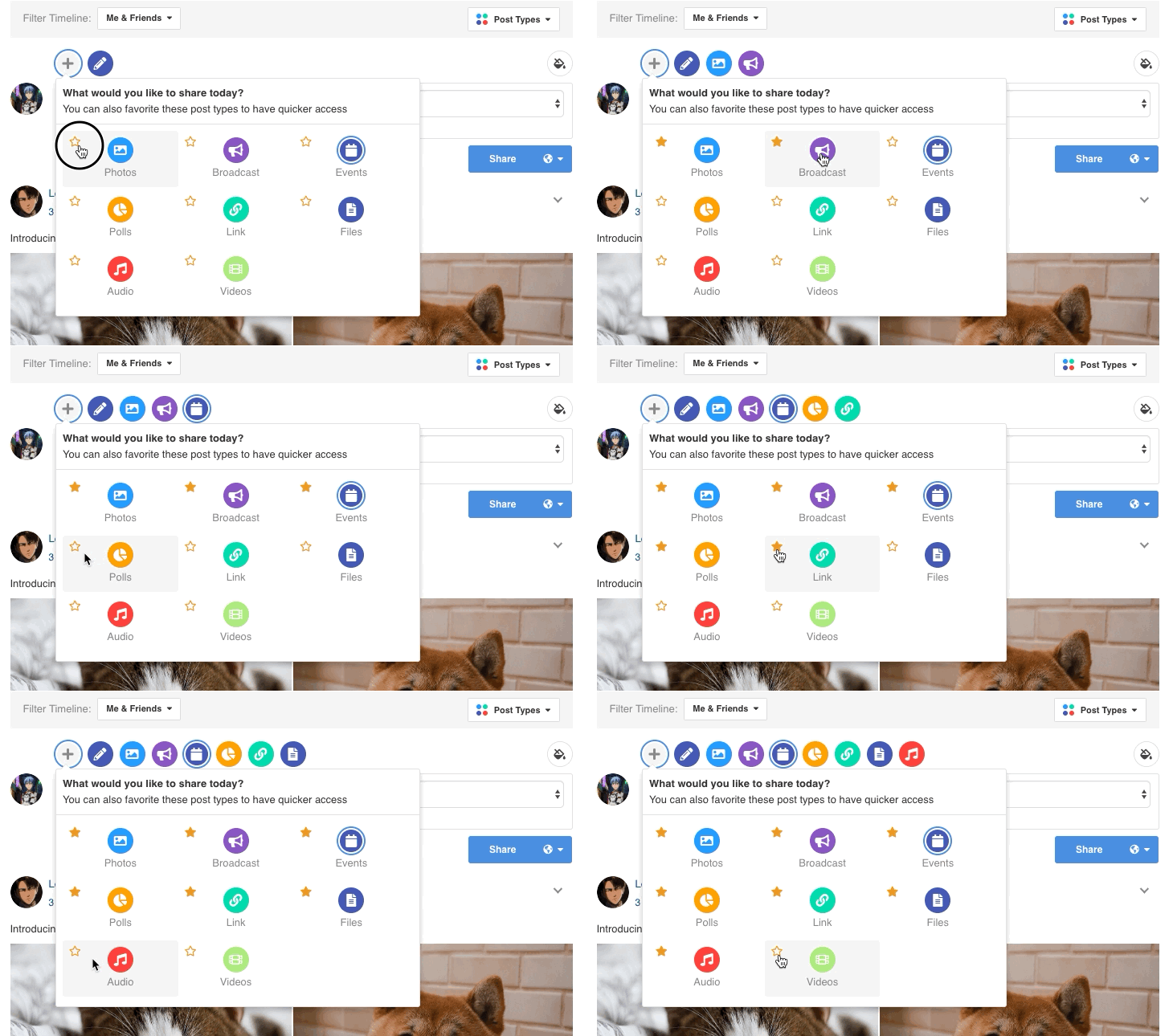
Redesigned Story Form
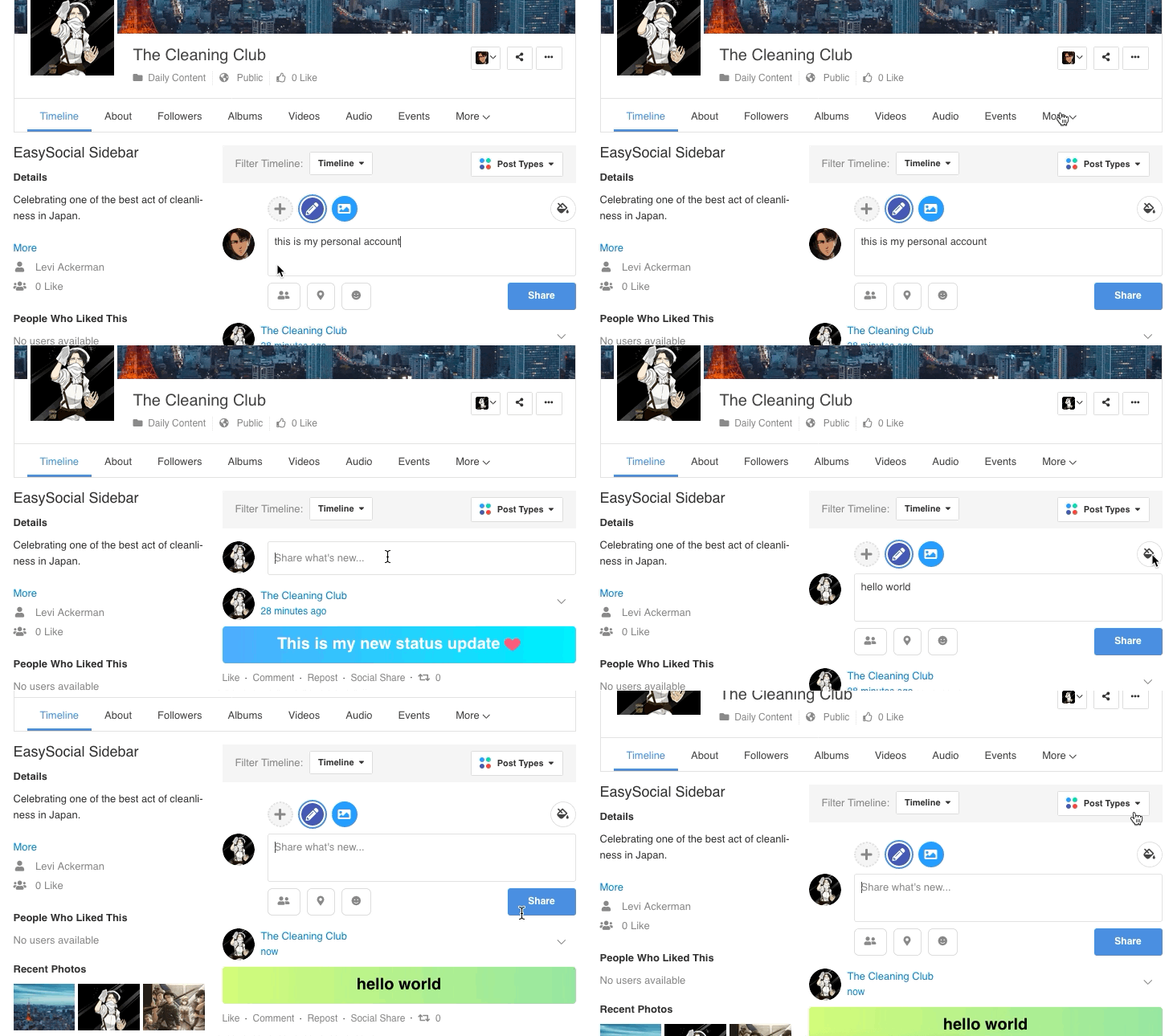
The brand new and redesigned story form in EasySocial 3.0 was revamped to have a rich user experience and it goes hand in hand with the overall new design. Apart from that, users are able to pick and choose their favorite post types on your story form as well.
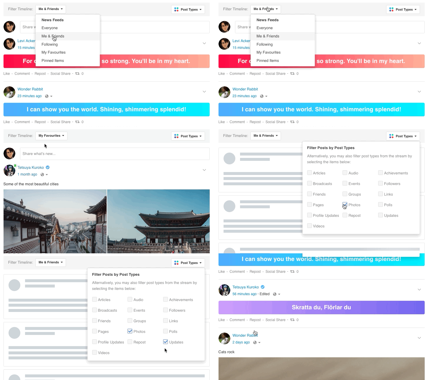
Curated Stream Filters
While the activity stream may be one of the key components in EasySocial, it has been curated from the inside out for EasySocial 3.0. Users can now easily filter through both the timeline and post types simultaneously which in return make searching for specific streams a lot more easier.
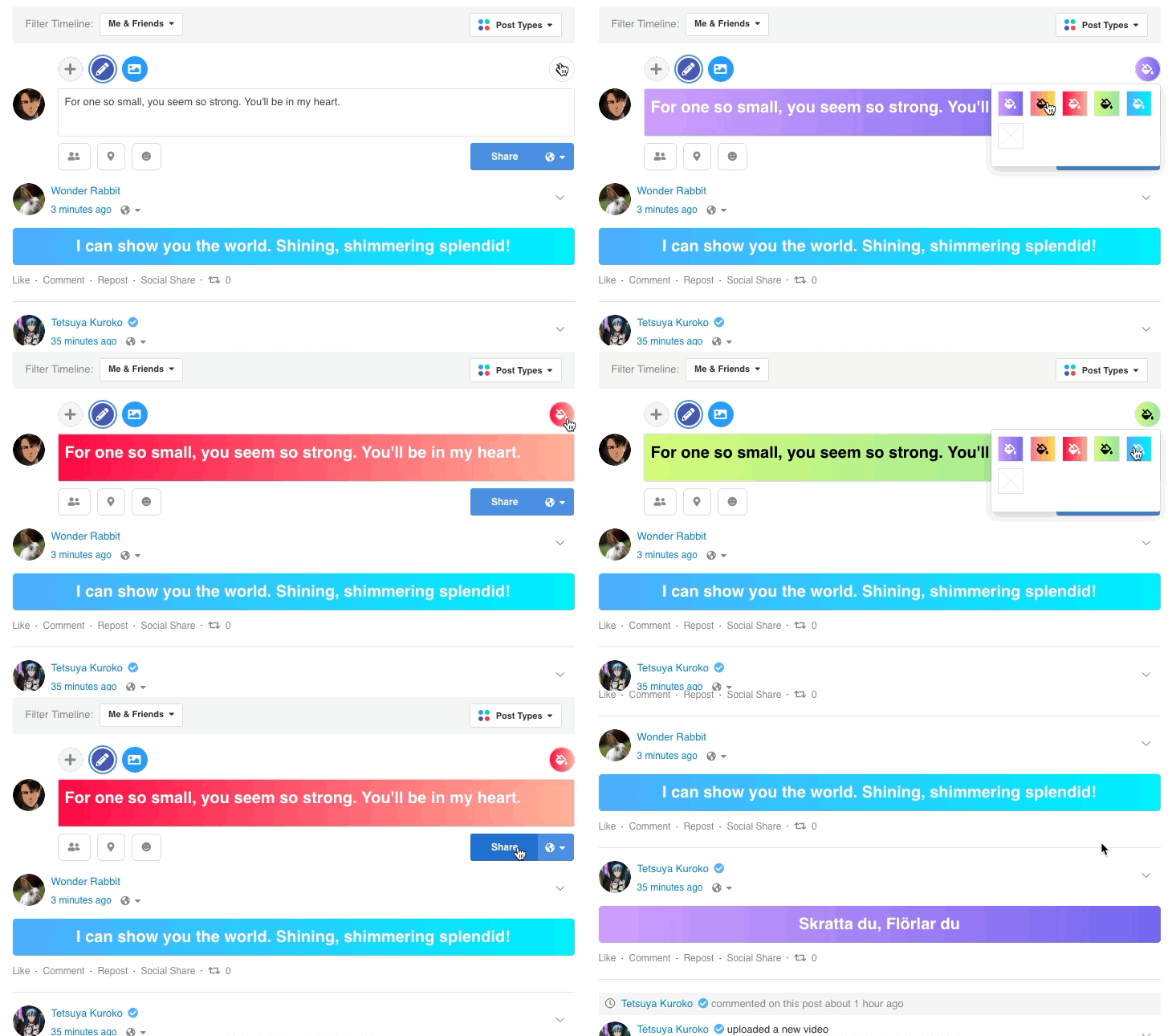
Custom backgrounds
The team added a fun element into posting status updates for EasySocial 3.0, users can pick and choose different background color from the brand new story form. Apart from that, admin will be able to add new gradient or solid color background from the back-end as well.
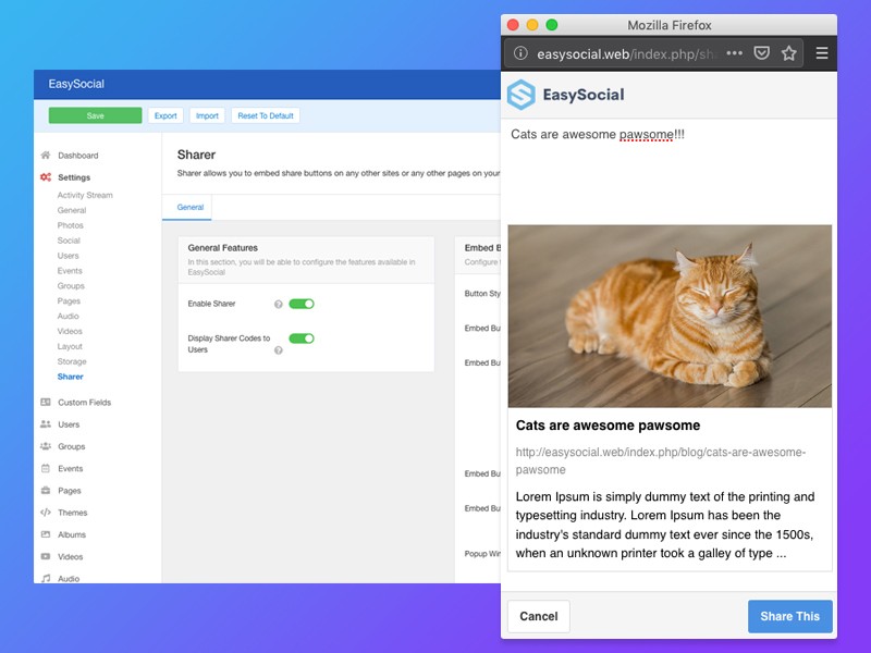
Embed Share Buttons
In EasySocial 3.0, users are able to generate share links on EasySocial 3.0's stream and these sharable embeddable buttons can be placed on any external sites almost effortlessly.
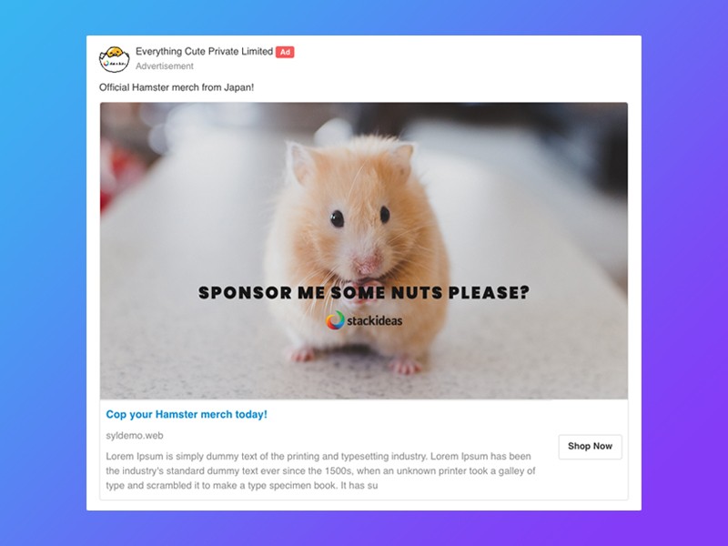
In-stream Advertisements
EasySocial 3.0 also introduces the all new in-stream advertisement. It allows site owners another alternative and practical way to monetize on their site, in order to maintain a healthy ecosystem for their social site and the community.
Emoji Browser
Adding new emojis have never been easier with the brand new emoji browser in EasySocial 3.0. Users can now simply type the character ":" and it would automatically suggest the available emoji on the site.
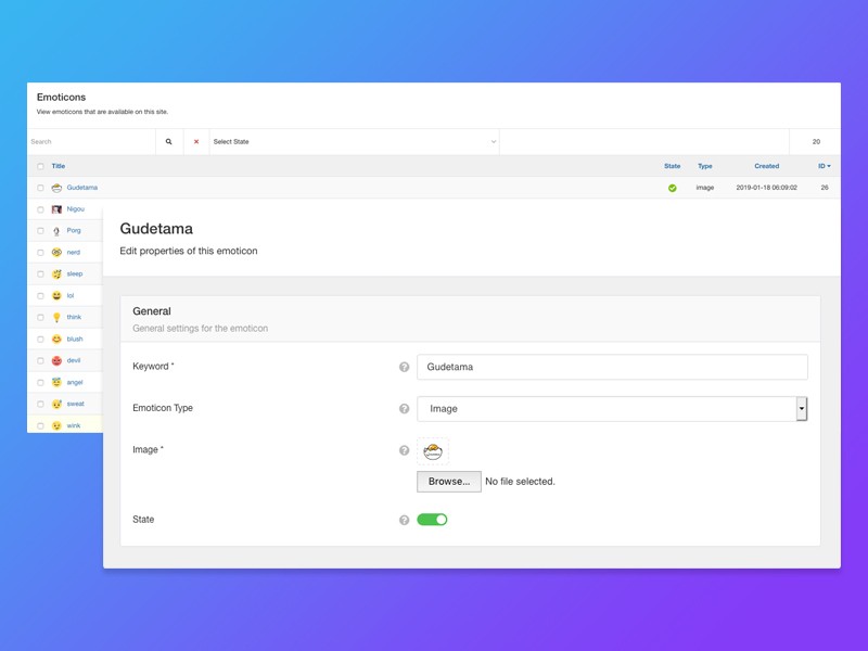
Emoji Management
Apart from the new emoji browser mentioned earlier, site admins can also easily add their very own images or custom unicode emojis (provided that your database supports it) directly from the backend as well.
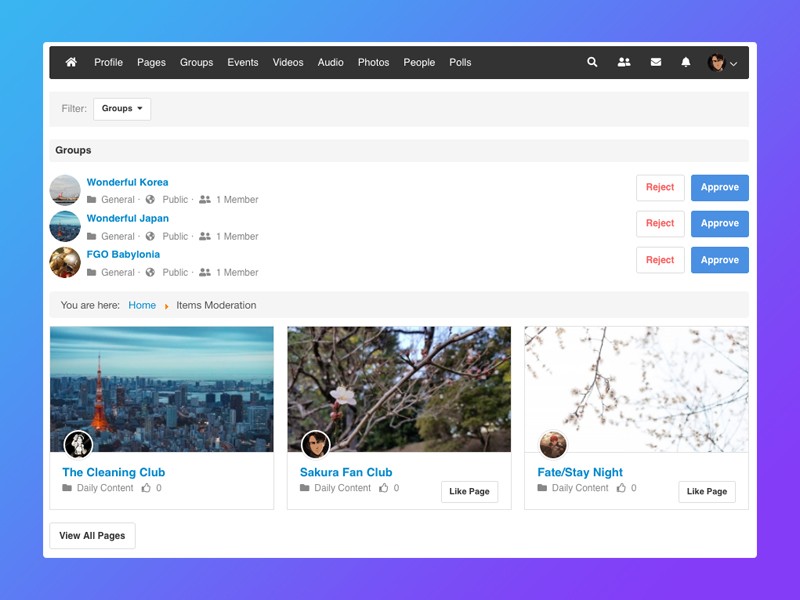
Frontend Moderation
With EasySocial 3.0, site admins have the ability to assign users with moderator permissions. That way, frontend moderators will almost have the same permissions as any site administrators and with the only exception of accessing the administrative area.
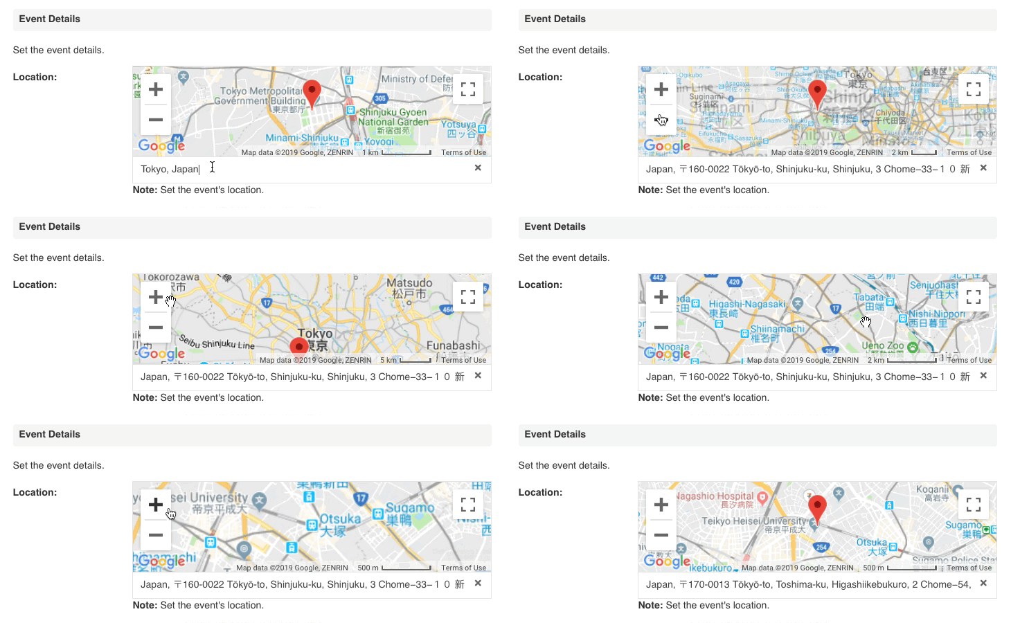
Movable Location Marker
What better way to mark locations instead of relying on suggested locations. Users can now easily drag the interactive marker on Google Maps across EasySocial 3.0.
Profile Header Customizer
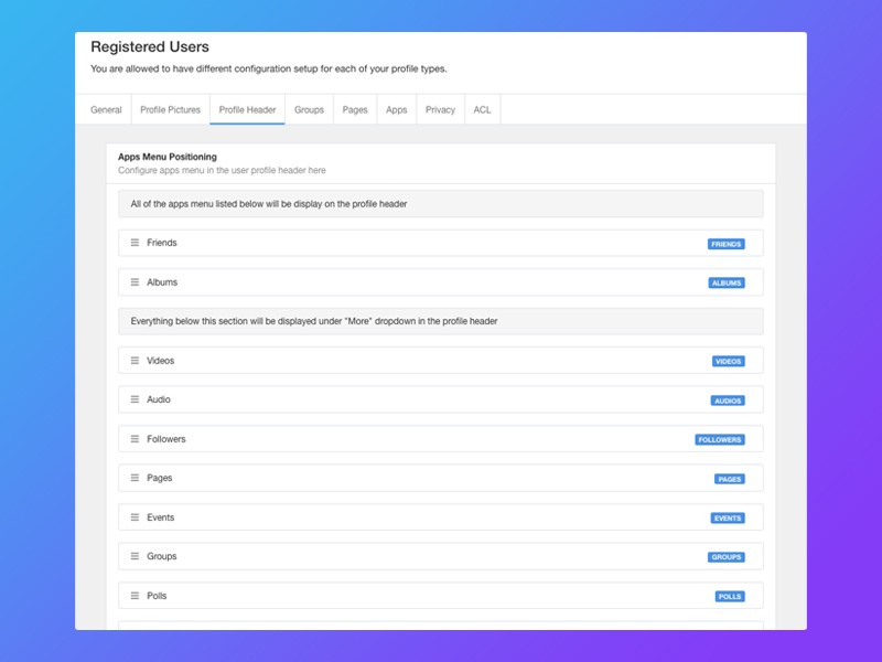
EasySocial 3.0 emphasizes a new approach of simplicity. With that in mind, site admins can now tweak and customize the layout of the apps that appears on the profile header of a user, group, page and event. This customizable header layout can be configured at profile types or category section.
Page Ownership
EasySocial 3.0 now allows page administrators the ability to choose to post comments or status updates on the page as the page owner or themselves. This would very useful for page owners to easily switch from the different accounts when posting a comment or a status update.
Better Photo Management
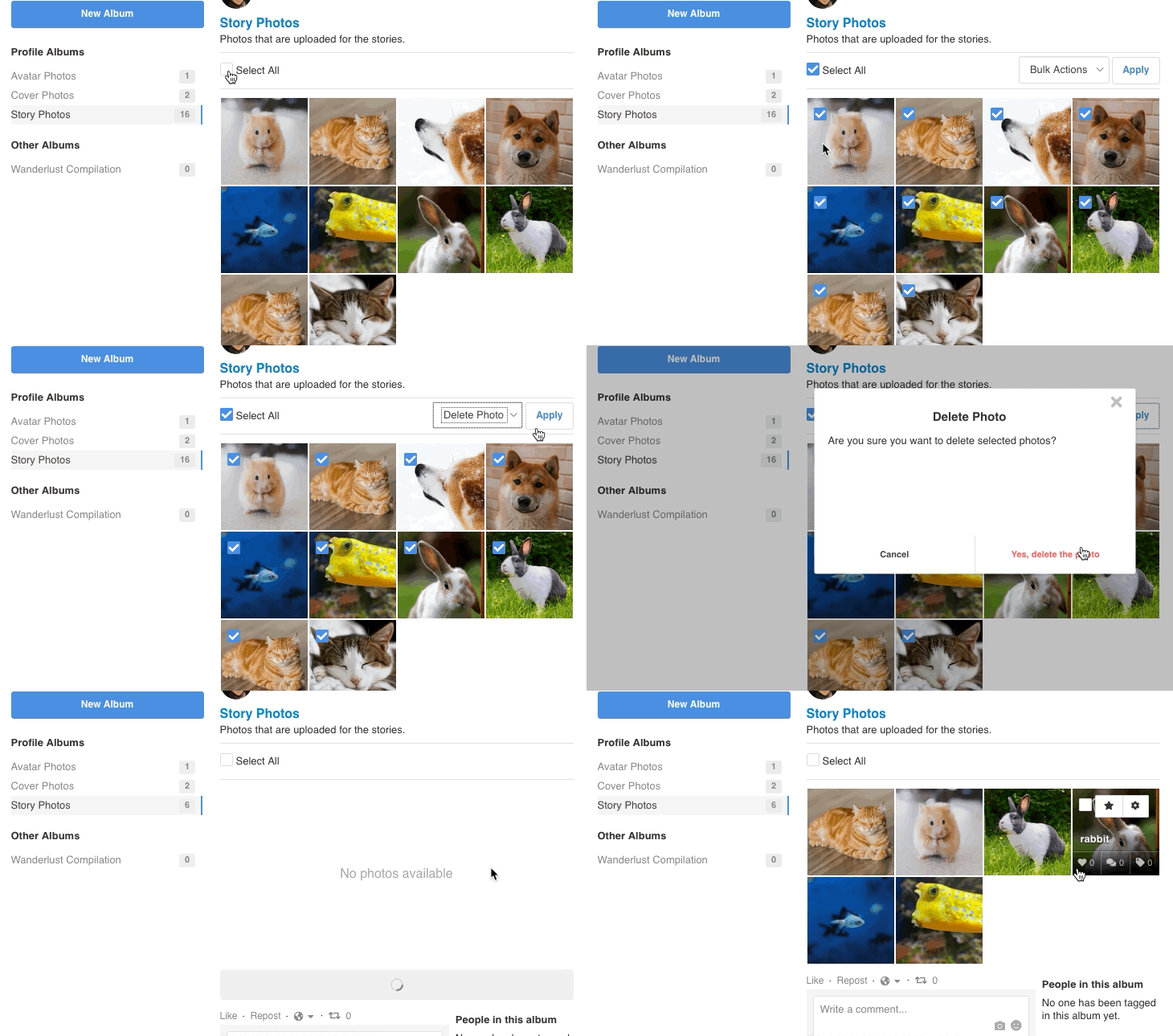
Another cool improvement that the team has applied into photos in EasySocial 3.0 was the ability to mass delete multiple photos in one-go.
Brand New Modules
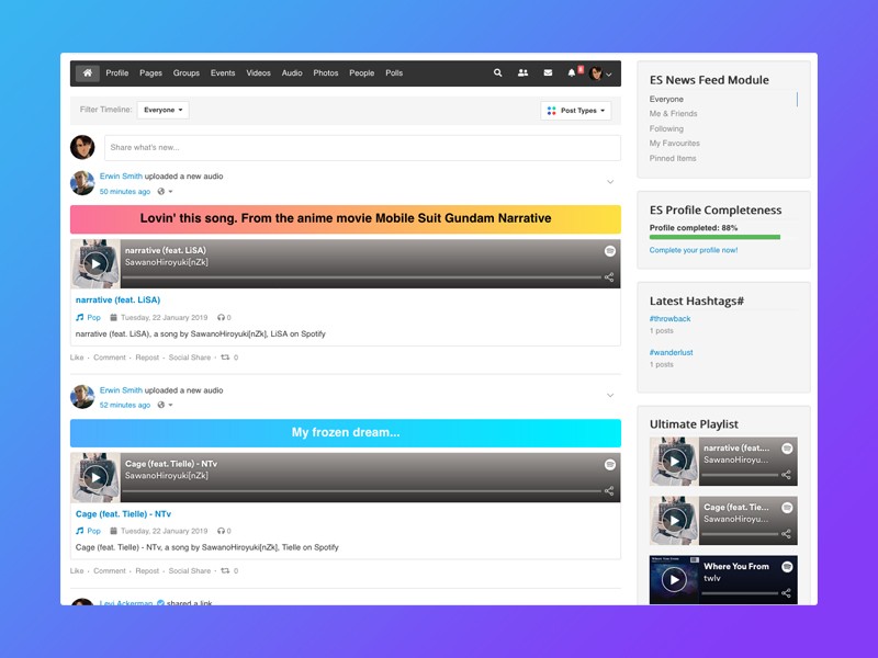
Now with the redesigned story form, curated activity stream filters, and redesigned dashboard. We will also be introducing two new modules that will work hand in hand with the all new curated activity stream filters.
These modules can be placed anywhere on your social site, and it would then allow users to filter currently viewed activities based on the filters set. Not to mention, this allows you to have a more flexible workspace as well.
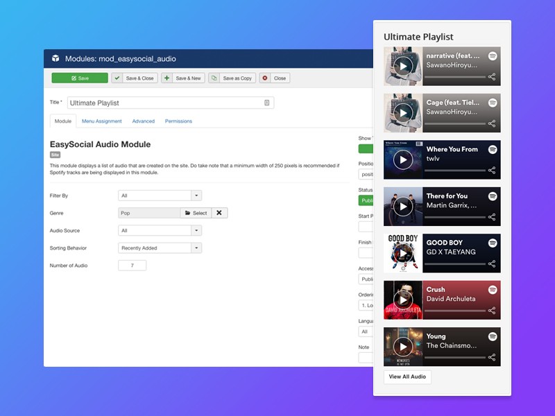
Recent Audio Module
A community that shares good music is a healthy community. The brand new recent audio module allows site admin to place a list of recently uploaded audio files/links in EasySocial 3.0.
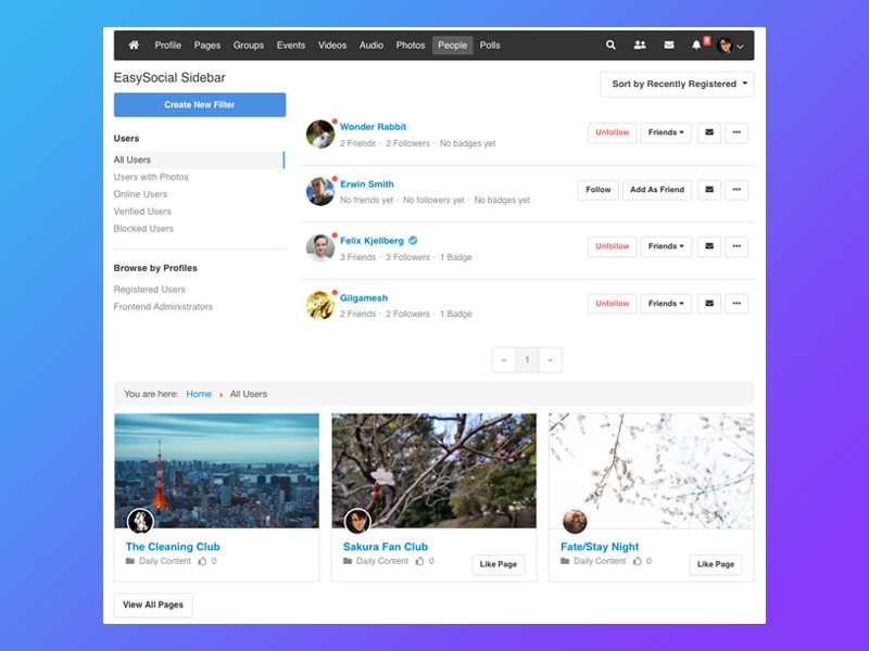
Horizontal Layout in Modules
The recent Events, Pages and Groups module will also receive a brand new horizontal layout. If you're familiar with the latest posts module in EasyBlog, you will notice the similarity of this module in EasySocial 3.0. Site admin can now showcase and promote events, pages or groups to appear horizontally anywhere across the site.
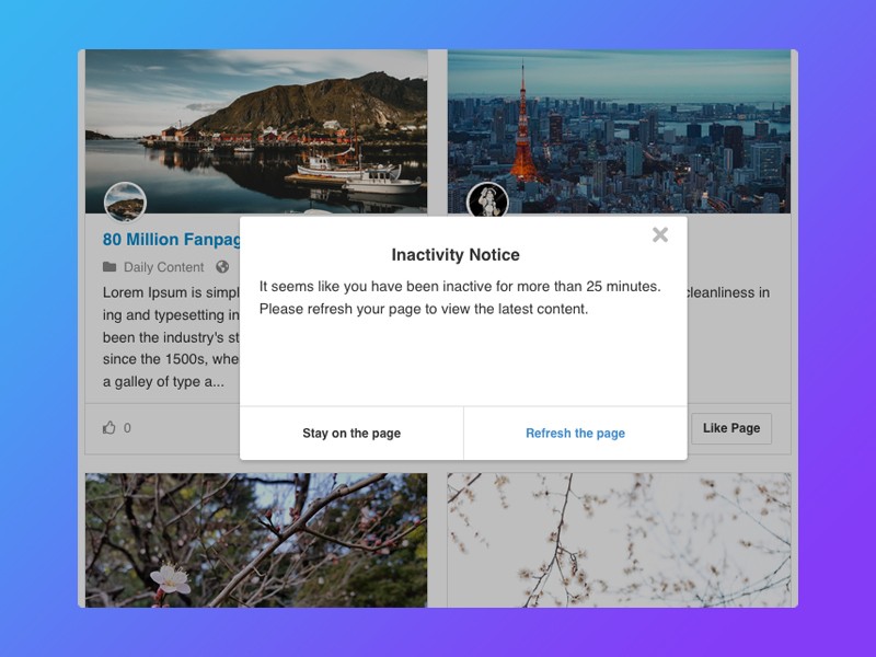
Page Inactivity Notice
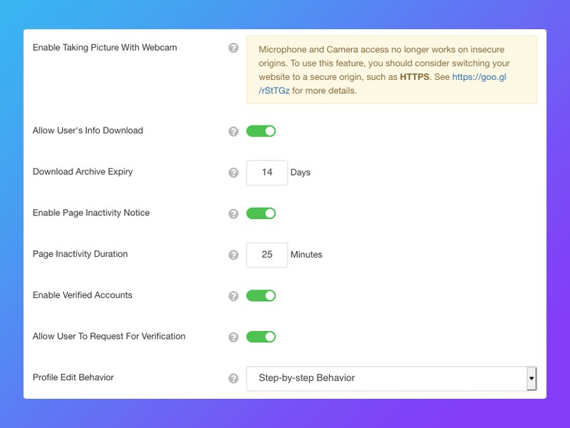
The pages in EasySocial 3.0 can now display a dialog to users when it reached the threshold of the specified time from their last activity. It reminds user to refresh the page in order to view the latest content.
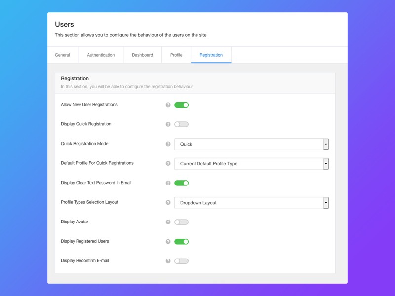
New Profile Type Selector
Another cool UX improvement added in EasySocial 3.0 comes especially useful for sites with multiple profile types. Users no longer have to scroll all the way to the bottom in order to select their desired profile type instead it can be displayed in a dropdown layout.
Profile Edit Behavior
The team also added all new profile edit behavior to EasySocial 3.0. Just like the normal profile edit, instead of having users jumping and skipping to any steps, users will have to strictly follow the step sequence in order to completely edit their profile page.
Overall Improvements
Since EasySocial 2.0, the team has already begun simplifying and centralizing our codes and design. Now fast forward to EasySocial 3.0, apart from all the heavily refactored and optimized codes, greater modularity and refined and improved UX for mobile view.
Thank You
Last but not least, we would also like to take this opportunity to also appreciate every single user and tester who helped us throughout all our testings. It won't be made possible without your feedback and bug reports.
Upgrading to EasySocial 3.0
Before upgrading to EasySocial 3.0, it's recommended to run a full backup of your site beforehand. Once that's taken care of, you may then download the full installer package found on your dashboard and upload the installer package via Joomla Extension Manager as you normally would.
For any reason you're not comfortable upgrading to EasySocial 3.0 on your own, feel free to create a new ticket here and our support team will gladly assist you with the upgrades.
Call to a member function getType() on null
Should you stumbled upon the error above, worry not. All you have to do is update the affected apps/plugins to the latest version.
