EasySocial 2.1 Beta 3
We have been wanting to push out the RC release this week but there was this inner feeling that kept reminding me to get our act together or we would regret pushing this release out.
The problem
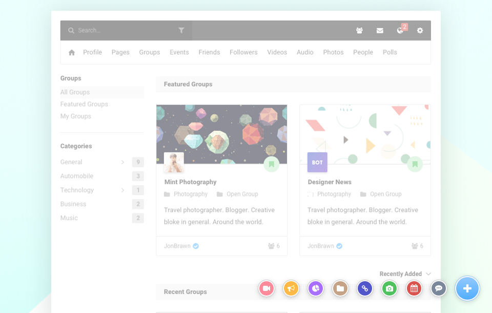
When we first unveiled Horizon, we included a cheeky tab in between the cover and the stream based on the feature request that we received. We did not spend more time trying to understand the fundamentals of such a request and just decided to slap the tab in between the cover and the stream.
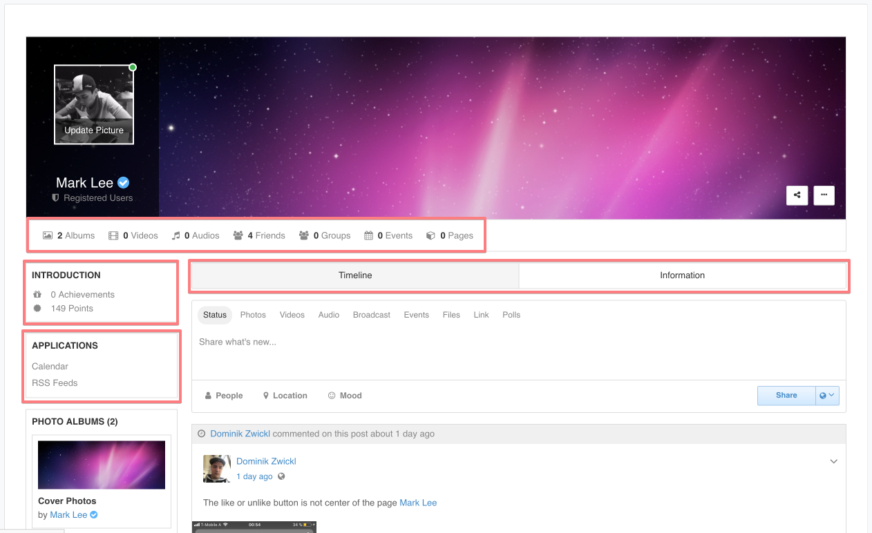
On the image above, you'll notice that these are the places that could be used to navigate when viewing another user's profile. It looks good because it is refreshing and new but when we started to receive feedback about the need of slapping these tabs everywhere else, we soon realized that this isn't the real solution. The underlying problem is still there as there are just too many links to click!
We had 2 options. The first was to just let everything be as it is and try to restructure it on the next major release (with a lot of guilt in our hearts). The second was to study the cover flow all over again and fix the underlying problem. We decided to go with the latter because it is crucial for us to get this right.
Not only because it made more sense, but there was this inner conscious that kept reminding me to get our act together or we would regret pushing this release out.
The solution
The underlying problem was simply because users are not aware or unsure about getting more details about another user. The reason for that is simply because there are too many links to click upon viewing another user's profile.
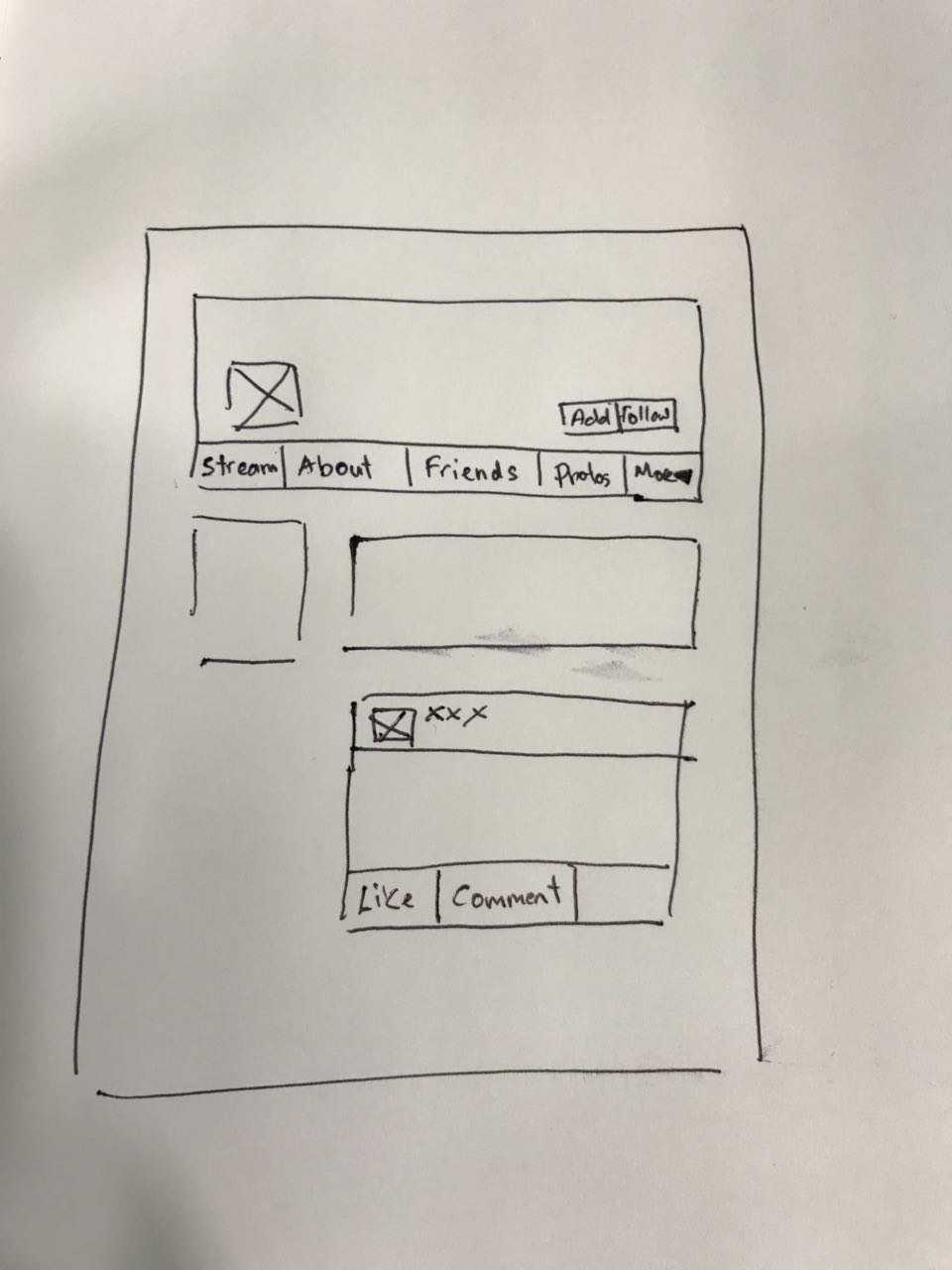
Our designers came up with several different drafts and it was only until then that we realized the statistics under the footer are there entirely for cosmetics purposes. We decided to unify the navigation and have it placed underneath the cover instead.
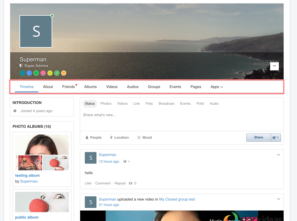
Redefining Horizon theme
When I looked at Horizon, it was all looking pretty until I realized that it would also pose some problems with the aesthetics especially when the names and titles are long. This is one of the most important aspect of your profile, groups, events or even pages. On the contrary, the overlay was vertical and not horizontal as the theme's name suggests. We decided to stick with the name and go with a horizontal overlay instead. It just looked amazing and it solved all problems!
As we still have time before pushing out Beta 3 (since we need to spend time revamping the cover flow) on the previous post, several users were also requesting for the possibility of changing the button colors in the settings. With Beta 3, one may now change the button colors in the settings. :)
Some other updates
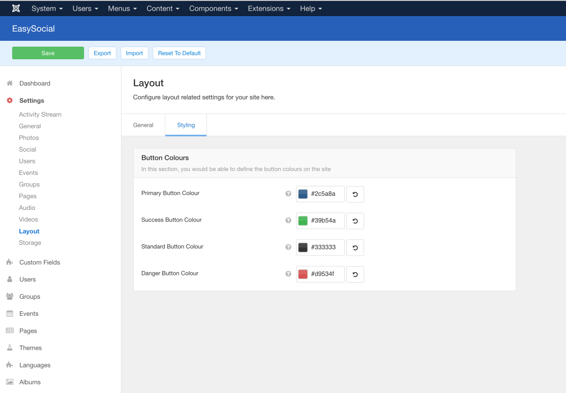
While the designers were toying with those ideas, the developers also tried toying with several ideas based on customer feedback. The ability to change the color of the buttons on your site.
This isn't just another simple color picker as we have a built-in algorithm that would beautify your buttons, regardless of any color that you pick. In essence, it would look great on just about any template.
Quick posting app
Since we had some spare time on our hands, we also developed a pretty cool plugin. This nifty plugin displays 5 different and individual bubbles in a pop-up form, each representing 5 different apps being integrated on your story form. It allow users to quickly post anything anywhere.